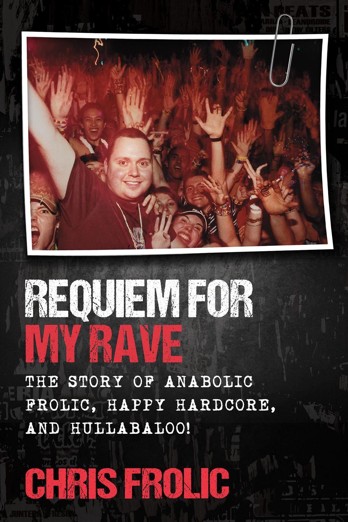
I’m really happy with how the cover turned out. This is the story of the process.
Initially I had found a very well-known cover designer. He has designed many famous book covers. I wanted something that I could put on my wall, that I could be proud of. I spared no expense in producing this book and was ready to pay whatever it took to make it happen. I contacted him and we had a phone conversation that lasted an hour. I talked about the themes of the book, of service, sacrifice, triumph through adversity, of creation.
“Wow, that’s a lot to fit into a cover”, he responded.
He wanted some time to think about it, and gave me an 8 week window to complete it. He gave me his price, but I had already decided I wanted him no matter what the price so it was quickly agreed to.
I guess the task of creating this cover was harder than he might have imagined. He sent me some art samples, but I didn’t like them, they were too “punk rock” and evoked more of a 1980s vibe which is not what that book is. Then he went quiet.
After the 8 weeks passed, I let it go another 2 weeks then followed up with him. He apologized, and then said he could get some ideas for me by the following week. This made it clear he had nothing done for all this time. I could keep waiting, or I could make a hard decision. I told him this isn’t working out and fired him.
I was back to nothing, with the months passing and my desire for a year-end release window passing. I then hunted for another designer. Again I was looking for the best I could find. After checking out a bunch, I settled on the most expensive quote I had. I was not shopping for a deal, I wanted the best I could get.
This time I thought I’d give the artist more direction. I had a photo that is spoken about in the opening chapter of the book. It actually was difficult finding this photo again. I remembered the magazine article and found it, then googled the name of the photographer on the credit. She remembered me and the shoot, but the photo was not digital, so it would be a hard copy in some box some where. She would have to search for it to see if she still had it. A week later she found it and I bought a release to use for the book.
I sent this photo to the new designer with some instructions that the book should represent the 1990s.
His first design looked like an alternate to “Saved by the Bell”, the colours, the fonts. It was 1990s alright, just not OUR 1990s. I sent it back.
He made changes to the colours and fonts, but it just wasn’t working for me. I told him to start over. I gave him the direction this time that I’d like a “true crime” feeling.
He then came back with something closer to what you see as the final cover. With some more tweaks and changes, we landed on the final design.
I love it, because it could both be a photo from someone’s scrapbook, but it could also be a photo in a police file. There’s the excitement of the photo, but still a sadness about it all. It walks a very fine line.
We nailed it, and represented the book perfectly.

